
Family owned and managed, Muc-Off is another UK retailer that’s going from strength to strength with its online business. Famous for their pink liquid bike cleaner, Muc-Off now offers a huge range or products linked to outdoor adventure.
Overview
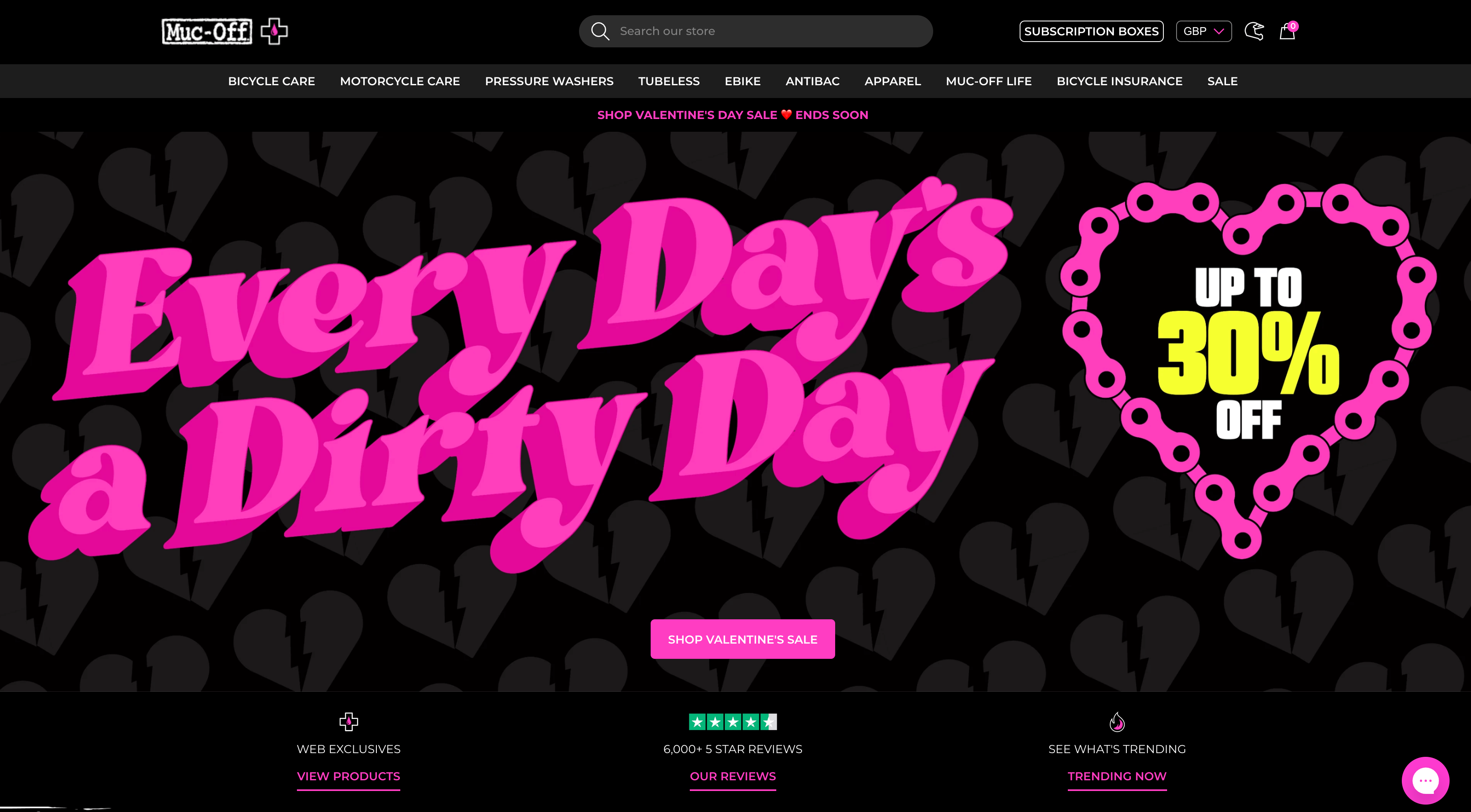
Muc-Off, web design is fantastic. The brand’s strong colours and amazing photography combined with custom graphics make the site really stand out. I’ve included a small Gif below just to give you a sense of the overall homepage design. It’s stunning!
I’ve broken this email marketing review into 4 core elements
- Lead magnet – (the method used to encourage a new subscriber to provide an email address.
- Opt-in – The method used to capture the subscribers information.
- Welcome email – the first email the new subscriber receives
- Landing page – the main webpage the new subscriber is encouraged to visit from the welcome email
Right, let’s jump right it!
Lead Magnet
After a few visits to the website, I did eventually see a few popups and slide-in boxes that offered me the same incentive, but on the first visit, the only obvious place I could find to subscribe was right down the bottom of a very long webpage. As I’ve already said, the website is beautifully designed and as a result, does effectively encourage browsing. There’s a good chance that some visitors make it this far down the page, but nevertheless, the majority won’t. Using a sticky bar in either the header of the footer of the page would allow the subscribe box to remain in the user’s eye line for the entire visit.
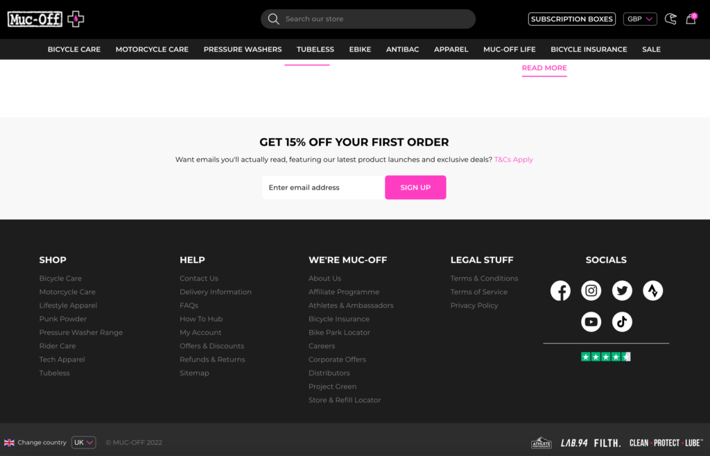
Using a 15% discount code as a lead magnet incentive for subscribers. Only taking email addresses and not taking the first name. The smart way of reducing friction on registration.
Opt-in
After pressing sign up the new subscriber is faced with a longer opt-in form which lets them choose from 9 different interests. These interests can then be passed as tags into their email software to allow for greater personalisation. Muc-Off has chosen a hybrid approach on its opt-in process. They minimised friction on the first step and then reintroduced some again in the way of the interest selection form.
The new subscriber has already given a micro commitment on the first screen and is now much less likely to abandon the form for the sake of ticking another box. Had they been presented with this form at step one, there’s a chance they would have felt overwhelmed (this is often described as “friction”)
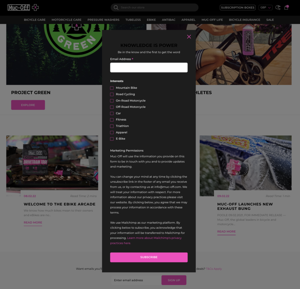
The form itself is dominated by the standard Mailchimp privacy disclaimer. The form is longer than a desktop screen scroll, so the mobile experience is very poor. The drop off on sign up could be significant due to this part of the process.
This isn’t the fault of the clearly talented design team, it’s a restriction within their marketing software. This could be overcome by using standalone opt-in software that passes new sign-ups into Mailchimp. A tool like OptinMonster is a good option for those looking to improve this part of their email marketing.
One other issue I picked up at this stage is the decision to provide the coupon code within the form as soon as the subscribe button is pressed. I suspect the logic is that they provide the code to the visitor whilst they’re on the website and can use it right away rather than waiting for an email. (interestingly the code shown on the website didn’t match the one sent in my welcome email, so there’s potentially a technical issue as well)
Again this could be another Mailchimp related problem. Mailchimp software doesn’t send welcome emails instantly. They run on 15 min cycles. This means anyone signing up at the start of the cycle won’t receive their coupon for several minutes. (another issue that can be solved by alternative opt-in software)
The issue I have with this approach is the code is being offered in exchange for an email address. At this stage, the email address hasn’t been validated and the code has just been issued regardless. This leaves the coupon code open to abuse. Fixing this problem is really straightforward and just involves adding the coupon code to the welcome email.
I love finding low hanging fruit and these two issues are really easy fixes that will significantly improve conversions and coupon code abuse.
Note: Oddly when I returned to the website after opting in, I was shown a slide inbox asking me to opt-in again. That’s not so unusual, but the opt-in form didn’t have all the clutter the main MailChimp one had, including any of the personalisation options.
Welcome Email
As mentioned above, due to the Mailchimp “feature” of 15 min automated email cycles, I had to wait 10 mins or so for the email to arrive. In fact, I did 3 submissions before realising what was to blame.
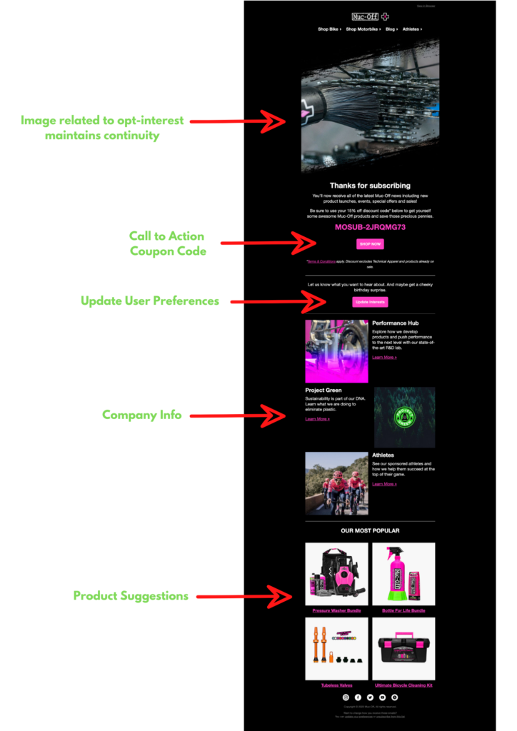
The welcome email as with all Muc-Off visuals is top-notch. Design and copywriting are all great.
Goal
The goal of the welcome email is a little blurred. The use of the coupon code is obviously implied, but the inclusion of unnecessary content at this stage has the potential to distract the reader.
Call to Action (CTA)
The inclusion of the coupon code directly above the shop now button is nice positioning and the use of brand colours lets the code stand out even more.
I subscribed a couple of times to see if changing the interests in the opt-in form made any difference to the email. Unfortunately, it didn’t. The same goes for the hero image at the top of the email, which shows the same image regardless of interests.
This is a real missed opportunity. After going to the trouble of grabbing the subscriber’s interests on the previous step, the first email they receive is not personalised in any way.
Update Preferences
The use of the second purple button is merely an update preferences option and serves as a distraction from the main CTA. I’d lose that button and move it to the footer of the email out of the way but in a place, the reader would find if needed.
Company Info
The next block of text is being used to share information about the company and what’s going on. It’s great branding and shows the business from different angles, but I wouldn’t include it in the welcome email series as it’s really more a nurture email. Including it at this stage makes the email longer than necessary and adds clutter.
Product Suggestions
I really like this block as it provides the opportunity to entice the reader to use the coupon code they just received. Two things would improve its use.
Firstly it should be moved up the email and sit below the shop now CTA (call to action). Secondly, the images shown in the block should be related to the interests we selected during the opt-in phase.
Landing Page
Clicking on the “shop now “link within the welcome email, simply directs the subscriber back to the regular Muc-Off homepage.
Again this feels like such a missed opportunity! At this stage we know the subscribers’ interests, we have sent them a discount code to use on our website, we could be sending them to a page with products that interest them most!
Rating – 6/10 “OK”
This was a really frustrating review. Muc-Off have all the elements in place to easily be an 8 out of 10. Where they drop the ball badly is on personalisation, or more accurately lack of it.
They have incredible content that their subscribers will love if they can just direct it to the right people when they sign up.
Once they connect, interests to welcome email, to landing pages they’re going to see engagement dramatically increase. Not only will conversions increase on that first welcome email, but any subsequent emails can also be tailored to subscriber interest as well.
I’d reduce the length of the welcome email by 50% and make its purpose crystal clear.
The frustrating part is the fact that they have done pretty much ALL the hard work at this point! The good news is fixing the issues isn’t a huge job that requires months of technical investment.


